
Thrill.com Is a Web Casino That Feels Like an App
Casino reviews
Thrill is a relatively new сasino (launched in 2025).
C-level team: Byron Petzer (CEO), Gad Hakimi (Head of Design), Ethan Cohen (VP of design), Craig Duckham, Terry Blankfield (Head of Operations)
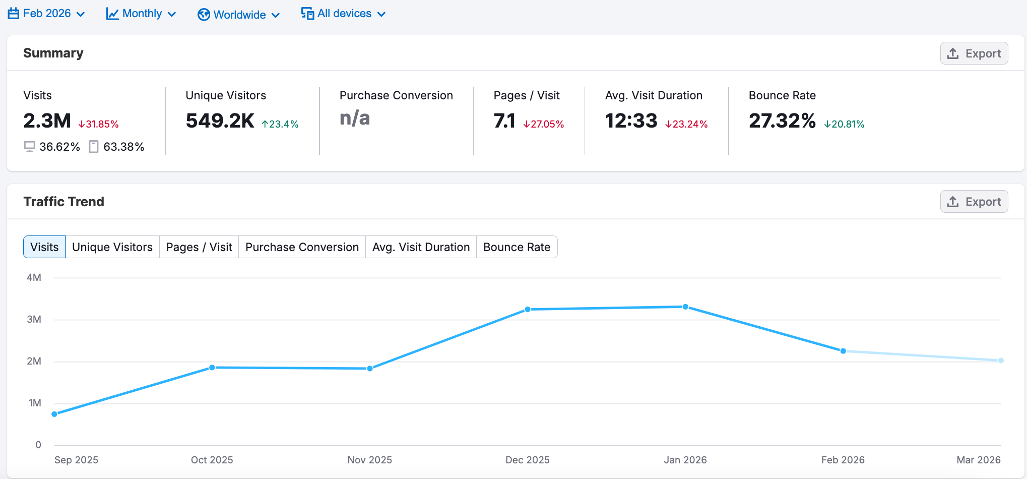
📈 Traffic (Feb 2026, estimates):
+ 2.3m visits/month
+ 549k unique visitors
+ Device split: 36% desktop, 64% mobile
+ Avg. visit duration: 12 minutes
+ Top countries (by visits): India, Norway, Croatia, Canada, Japan
📊 Tools (what they use under the hood)
- SvelteKit
A modern web app framework that helps the site feel app-like: fast navigation, smooth UI, and strong performance on mobile. - Cloudflare Bot Management + Cloudflare Turnstile
That's serious anti-bot and anti-fraud protection (blocks automation, reduces fake sign-ups, adds friction only when needed). - PWA (Progressive Web App)
Allows an “installable” web experience and can support push notifications and faster repeat visits. - Intercom
Live chat + lifecycle messaging (very convenient to communicate with users and even send push notifications) - Google Analytics (GA4)
Core web analytics for traffic.
📣 Social Media Presence:
+ Telegram: 4.5k followers; X/Twitter: 10k
+ Discord: 3k, Instagram: 4k.
Having these four channels Telegram, X, Discord, and Instagram, is basically the iGaming “must-have” stack today. For most crypto casinos, X tends to be the biggest owned channel by followers.
Well, actually, there are a few notable exceptions; brands like Stake, Roobet, and Rainbet have stronger Instagram numbers, but we understand why: They rely more on influencer and streamer marketing.
🧩 DESIGN OVERVIEW
Their entire UI is built around one core idea: make the web feel like a mobile app.
Guys, seriously. It doesn’t feel like you’re playing on a website, but on a native app.
Evidence: why it feels like a native mobile app
- Instant navigation
Transitions feel seamless, with no “page reload” vibe. - Mobile-first layout
Hierarchy, button sizing, spacing, and typography are built for thumbs first (not “desktop-first, then decreasing everything in size” - a very common way). - Clear CTA hierarchy
Primary actions (Sign up / Log in / Play) are always visible and visually prioritized, like in real apps. - Fast feedback loops
Every action responds instantly (button states, micro-animations, highlights, balance/status updates), which creates that “app feel.” - Low-friction onboarding
Sign-up/login is integrated into the flow and feels like part of the product.
Let me prove my point: Rainbet vs Thrill sign-up flow
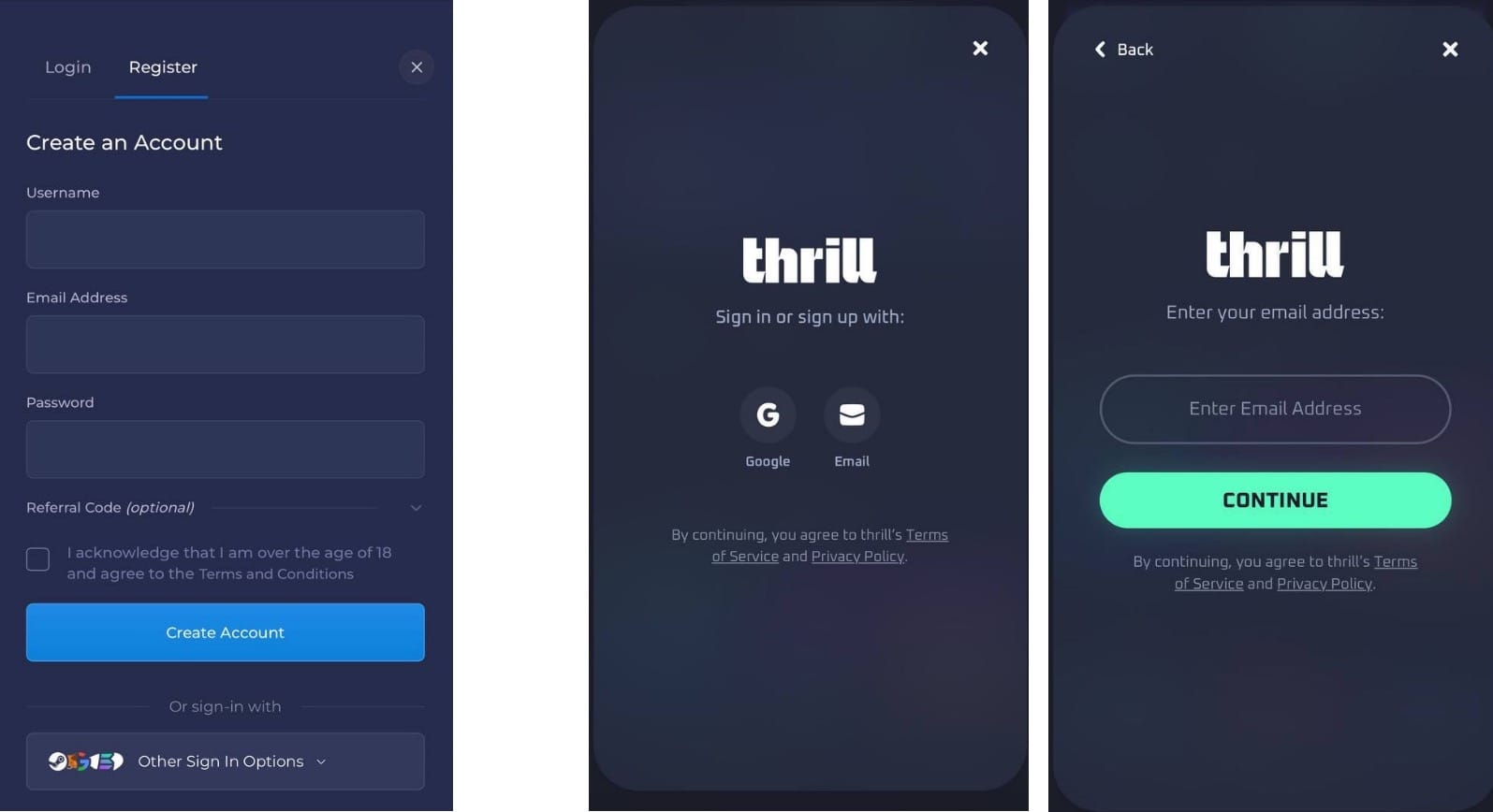
A) Welcome screen/entry pattern
+ Thrill: starts with a branded welcome screen and just two login options (Google / Email). → Classic mobile-app pattern: choose the method first, enter details second.
+ Rainbet: opens with the full registration form (username, email, password, 18+ checkbox, referral, CTA). → Typical web-first sign-up page.
B) Visual noise/cognitive load
+ Thrill: no tabs, no long form upfront, no field overload. It’s a step-by-step flow where the user makes one small decision at a time.
+ Rainbet: many elements on one screen. It feels like a page.
Takeaway: Thrill optimizes for an app-like onboarding experience; Rainbet optimizes for a classic web form completion.
Fun observation: The UI feels heavily iPhone-inspired. The homepage has a “notch” style top area that mimics the iOS look.
🧩 PRODUCT OVERVIEW
🧾 Registration Options:
+ Email, Gmail
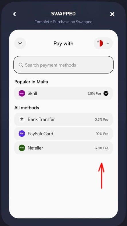
🧾 Deposits:
+ Supports most major cryptocurrencies.
+ Offers Buy Crypto + wallet deposits via Swapped.
If you manage payments, here’s the interesting part:
a) A big reason casinos integrate providers like Swapped is UX. They smooth out one of the most common friction points in iGaming payments: the clunky, “not-on-brand” deposit experience you often get with non-crypto methods (extra steps, redirects, inconsistent UI).
b) Transparency: users see the exact fee upfront, so they know what they’ll pay before confirming.
🎮 Games & Content:
+ 38 game providers/game studios.
+ Originals: 9 games - Dice, Limbo, Blackjack, Keno, Plinko, Mines, Crash, Hilo, Slide.
Fun fact: before they acquired the domain, thrill.com used to be a dating site 😄

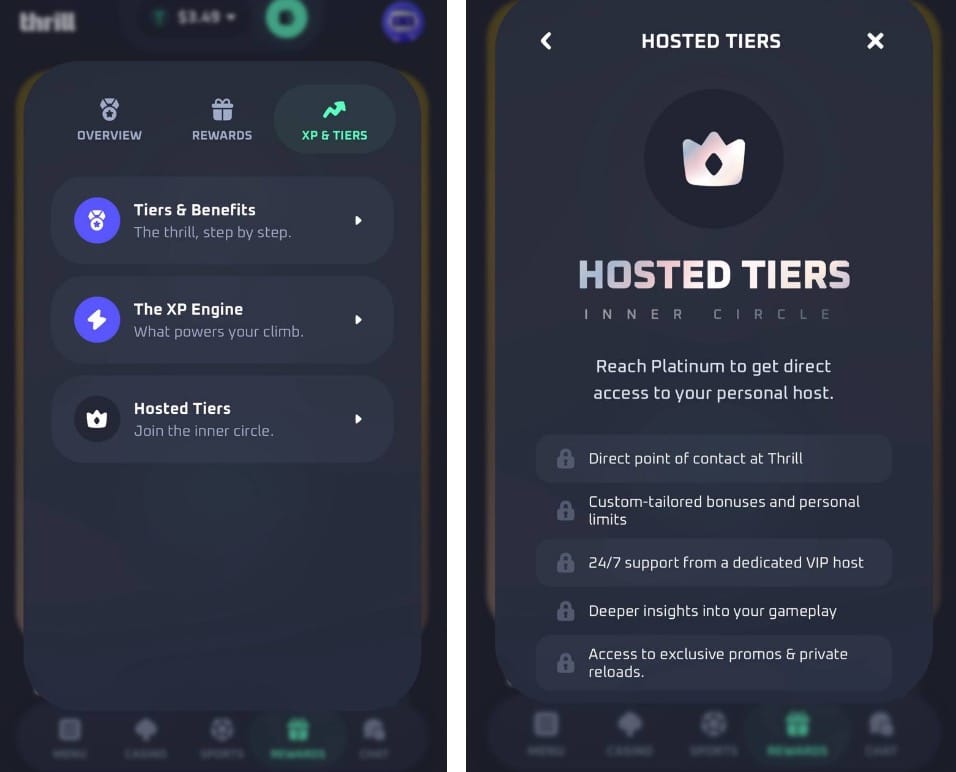
👑 VIP program:
+ Users get a dedicated VIP host once they reach Platinum: 250,000 XP.
Based on Thrill’s XP conversion, that level roughly implies:
Casino: ~$71k wagered (assuming 3.5% house edge and 1 USD wager ≈ 3.5 XP → 250,000 / 3.5 ≈ 71,400)
Sportsbook: ~$83k wagered (1 USD wager ≈ 3 XP → 250,000 / 3 ≈ 83,300)
+ Reach Platinum to unlock Hosted Tiers and get a dedicated VIP host with a direct contact. This usually implies an assigned host (name + direct messaging), alongside custom bonuses and exclusive promos, I suppose.
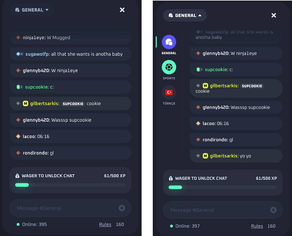
💬 Player Chat:
+ Player needs 500 XP to unlock it (≈$140 wagered, depending on XP rate).
+ There’s a separate Sports chat. Very common nowadays.
+ There’s also a Turkish room.
Why is there a dedicated Turkish chat?
a) a significant group of Turkish VIP players, or
b) Turkey is a meaningful market for Thrill (big/active enough)
My bet is (b) - VIPs are usually managed 1:1 via hosts and private channels, while public chat rooms are built for the broader active user base.
🧑💻 Customer Support:
+ First reply was fast (under ~30 seconds)
+ Live chat via Intercom (of course)
⭐ Features I liked
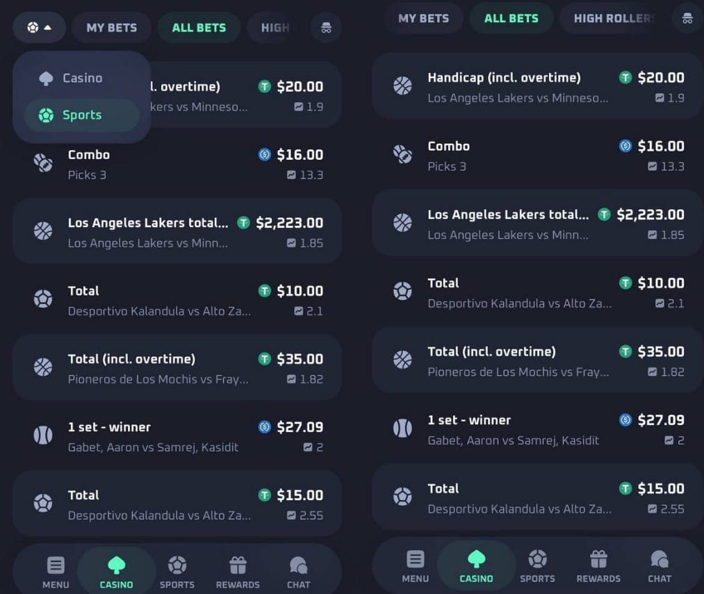
a) Unified “All Bets” feed
It shows sports bets as well. I mean, usually you see just casino bets.
So that’s becoming rare lately, and it makes the product connected across verticals (Casino and Sports betting).
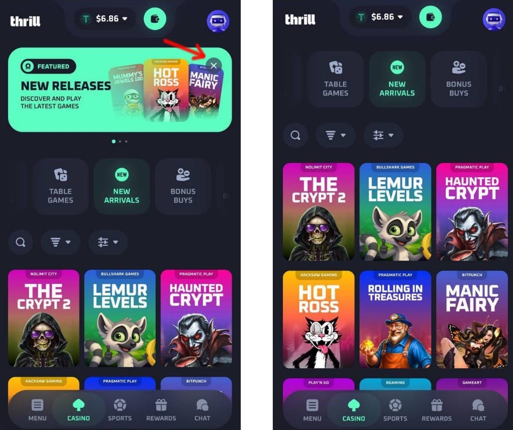
b) You can hide promo banners!
Amazing UX decision.
Most casinos force promos on every screen forever. Here, users can clean up the interface, which instantly feels more premium and respectful. I feel it also sends a strong signal to players: “We care about your experience”.
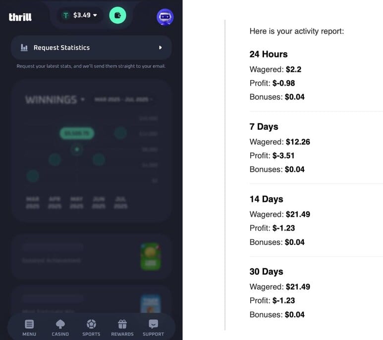
c) Last 30 days stats
Great idea. Users can request 30-days stats and Thrill will email it to you a few minutes later.
They don’t display stats directly in the settings. My guess, it's an operational choice: Showing these stats live for everyone would likely put extra load on the backend, so Thrill keep it simple: you request the report and get it by email.
The report is useful, but pretty limited. It includes wagered amount, profit, and bonuses claimed.
I expected a richer breakdown, for example: total withdrawals, number of bets, and maybe top 1–2 biggest wins / games.
💡 Conclusion:
+ Huge respect to the team for committing to one clear idea: build a web casino that feels like a native mobile app. That’s a very interesting way to differentiate from others.
+ Everything seems to flow from that decision: mobile-first UX, clean screens, fast onboarding, and “app-like” patterns across the product.
+ For iPhone users, this is honestly one of the most polished web casino experiences I’ve seen.
+ There’s still room to improve: better player stats, clickable promos/offers, and a proper language switcher (yeah, you can't switch language 😁).
Overall, this is an impressive product, and best of luck to the team!
Comments